The retro AI portrait wave is everywhere—here’s why it works and how people are doing it
Scroll Instagram this week and you’ll see it: warm side light, soft-edged shadows, film grain, and faces that look like they were shot in a 1970s studio. The quick “nano banana” gag is fading. In its place, creators are using Google Gemini as a proper art tool—writing tight prompts, referencing real photo techniques, and getting portraits that pass for pro work.
What’s changed? People aren’t asking the AI to “make it cool.” They’re telling it exactly how a photo should feel: the direction of light, the lens vibe, the color temperature, even the grain. When you describe light as “warm from the right,” call for “soft shadow roll-off,” and specify “matte skin, subtle film grain,” the model has a map. The result is a portrait that reads as vintage without turning the face into a caricature.
The other piece is identity. Creators want the style to change, not the person. That’s why you see prompts that stress a perfect match to the source face, or workflows that start with sharp, well-lit originals. The AI can push wardrobe, palette, and background while keeping bone structure, hairline, and eye shape intact, which keeps it shareable—and safe.
It also helps that retro photos do what social media loves: they tug at memory. People recognize the cues—glossy studio walls, Kodachrome tones, Polaroid frames—and stop scrolling. They ask for prompts. They try it themselves. That loop pushes more examples into Explore, which brings more people in. It’s not just a filter; it’s a look you can repeat and evolve.
15 refined prompts that nail the vintage look (and why they work)
Use a clear, well-lit base photo. If your original has clean light and detail, Gemini has more to hold onto while it builds the retro style around your face. Tweak wording to fit you—skin tone, hair, wardrobe, era—and run multiple variations to find the best version.
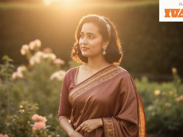
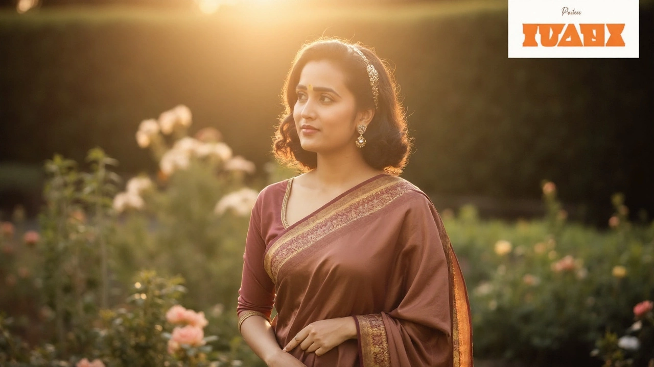
Classic studio retro (saree edition): “Create a crisp, high-detail portrait of a young Indian woman in a translucent red saree over a fitted blouse, white jasmine tucked behind the right ear. Warm key light from the right, soft shadow cast on a plain, beige wall. Calm expression, head slightly turned right. Matte skin, gentle film grain, studio vibe from the late 70s. Keep face identical to the reference.”
Modern menswear, old-school light: “Portrait of a young Indian man in tailored casuals—open-collar shirt, clean styling. Warm side light from camera-right, soft-edged shadow on a cream wall. Subtle contrast, minimal color cast, vintage portrait mood. Preserve the exact facial structure.”
Fantasy hero, restrained: “Reimagine the subject as a grounded fantasy character. Natural fabrics, muted jewel tones, weathered leather accents. Background: misty forest edge with shallow depth of field. Soft rim light around hair, pastel haze, dreamy but realistic. Do not alter facial identity.”
Ethereal glow: “Soft pastel palette, floating dust motes and faint bokeh sparkles. Diffused top light, gentle highlight on cheekbones, velvety shadows. Calm gaze, airy composition, subtle grain like fine art paper. Facial match must remain accurate.”
Steampunk workshop: “Victorian silhouettes with brass and leather details—monocle, gear motifs, stitched waistcoat. Backdrop: dim workshop with cogs and soft amber practicals. Shallow depth of field, warm highlights on metal. Keep the face true to the original.”
Space explorer cockpit: “Futuristic portrait from a spacecraft cockpit. Star field outside, cool rim light from instrument panels, warm key from the right for contrast. Reflective glass, crisp detail on suit seams. Identity must match the reference exactly.”
Garage glamour (Urus vibe without the brand splash): “Top-down, three-quarter overhead frame of a man lounging on a glossy red performance SUV in a dim basement garage. Open white shirt, brown trousers, polished shoes, leather strap watch, forearm tattoo visible. Single sunbeam cutting through dust, cinematic warmth, creamy bokeh. Hyper-real detail, luxury mood.”
Seaside balcony romance: “High-detail portrait on a beach-view balcony at golden hour. Navy shirt, white trousers, loafers, sunglasses in hand. Breeze in the hair, soft backlight from the ocean, crisp edges on sunglasses. Light, refreshing, romantic tone.”
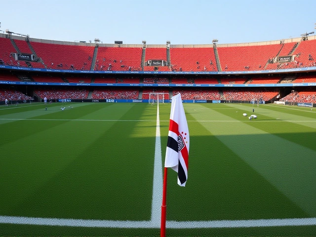
Football focus, profile: “Profile portrait balancing a red-and-white football on the forehead. Upright posture, neck elongated, lips relaxed. Solid deep-blue background for strong contrast, dramatic side light shaping the jawline. Clean pro kit, realistic texture. Keep face unchanged.”
Celebrity Polaroid candid: “Instant-film look with off-center framing and a bright on-camera flash. Slight overexposure on skin, soft falloff at edges, hand-written date at the bottom border (no logos). Casual posture, deadpan expression. Realistic Polaroid chemistry tones. Identity preserved.”
1970s Kodachrome studio: “Head-and-shoulders portrait with a rust-orange paper backdrop. Warm key from the right, gentle hair light, subtle grain like ISO 100 film. Slight cyan in shadows, muted saturation. Natural makeup, period-accurate color mood.”
Film noir monochrome: “High-contrast black-and-white portrait with Venetian blind shadows across the face. Single hard key from the side, smoky atmosphere, matte blacks. Classic noir composition, mid-century mood. Face fidelity must be exact.”
’90s studio gloss: “Glossy studio portrait with smooth backdrop gradients—teal-to-purple or charcoal-to-slate. Softbox key, catchlights at 10 o’clock, gentle glamour retouching. Wardrobe: simple tee or satin shirt. Clean, commercial look from the late 90s.”
Y2K magazine cover: “Vibrant early-2000s styling—gelled backlight, subtle lens flare, glossy skin finish. Bold pose, dynamic crop, harmless faux cover text (no trademarks). Electric blues and silver highlights. Keep the original face perfectly intact.”
Jazz-club 1950s: “Moody bar interior with smoke-haze and warm tungsten sconces. Soft spotlight from above-right, velvet backdrop tone, shallow depth of field. Classic tailoring, relaxed pose, grain like pushed 400 film.”
These prompts lean on three pillars: light direction, texture (grain and contrast), and setting. You can swap outfits and props, but keep the lighting notes. That’s what sells the era.
Want to go deeper? Here’s how creators are shaping consistent results that hold up on big screens and still look clean in a 1080-by-1350 Instagram frame.
Start with a clean base photo
- Use a sharp, well-exposed portrait with neutral lighting. If the source is noisy or underexposed, the AI has to fix that before it can style anything.
- A plain wall or uncluttered background helps the model draw clean shadows and silhouettes.
- Frame mid-chest to crown for classic portraits; for lifestyle scenes, leave space for environmental storytelling.
Write prompts like a photographer
- Specify the light: “warm key from camera-right,” “soft edge shadow,” “gentle rim light.”
- Describe texture: “matte skin,” “fine film grain,” “low halation,” “subtle bloom on highlights.”
- Call the mood: “studio 1970s,” “noir,” “magazine gloss,” “instant film candid.”
- Protect identity: “keep facial features identical,” “do not alter bone structure,” “match to reference.”
Tune composition and color
- Ask for lens feel: “50mm natural perspective,” or “85mm portrait compression.”
- Note color temperature: “warm 4200–4800K key,” “cooler fill for contrast.”
- Pick aspect ratios that fit feeds: 4:5 for posts, 9:16 for Reels, 1:1 for grids.
Run variations, curate hard
- Gemini can produce noticeably different takes from the same prompt. That’s a feature. Generate a few, shortlist the cleanest faces and the most believable light.
- Small wording changes matter. Swap “hard light” for “soft wrap,” or “matte” for “gloss,” and you’ll feel it immediately.
- When in doubt, simplify. Too many adjectives can create mush. Keep the lighting and mood notes, drop the rest.
Keep faces consistent
- Use a clear reference photo and say so in your prompt: “match the face to this image.”
- Avoid asking for heavy age changes or extreme expressions; those can break identity.
- If a detail drifts (eye color, hairline), call it out in the next prompt: “do not change eye color,” “maintain original hairline and texture.”
Polish without overdoing it
- If you edit after generation, keep it minimal: a touch of exposure, a small contrast curve, gentle vignette. Over-sharpening can expose artifacts.
- Export large (4K or higher) and downscale for Instagram. Downscaling hides fine artifacts and keeps edges smooth.
Why the vintage look travels on social
- Nostalgia reads fast. Film cues—grain, halation, warm tungsten—are recognizable at thumb speed.
- It’s teachable. Prompts are easy to share, remix, and improve. Comment sections become mini-workshops.
- It’s personal. The face stays yours, so the art feels like “you,” not a random avatar.
Common pitfalls and easy fixes
- Plastic skin: Add “matte finish,” “fine grain,” “subtle texture on pores.”
- Overdone bloom or glow: Say “minimal halation,” “controlled highlight bloom.”
- Weird ears or hands in lifestyle shots: Reinforce “anatomically accurate,” or crop tighter.
- Color cast too strong: Specify “neutral skin tones,” “balanced white point,” and define the warm/cool split in the light rather than the whole image.
Ethics and safety still apply
- Only use photos you own or have permission to use. Don’t restyle someone else without consent.
- Label AI imagery if context matters. Polaroid-style shots can feel documentary—make sure friends and followers aren’t misled.
- Skip brand logos and trademarks in faux magazine covers or car shots. You don’t need them to sell the vibe.
A quick workflow creators are using
- Pick a sharp, well-lit portrait with a simple background.
- Choose a single era or aesthetic—don’t mix too many cues.
- Write a short prompt that covers light direction, mood, and identity preservation.
- Generate multiple versions; save the top two.
- Apply a light polish (exposure, contrast), then export for the platform.
- Share the prompt in the caption or as a carousel swipe—this drives saves and comments.
The point isn’t to imitate one viral look. It’s to pick a consistent visual language you can repeat across posts: the same light, the same grain, the same palette. That’s how accounts build a recognizable style quickly without a studio or a rental kit.
And yes, the “nano banana” phase was funny. But the leap to thoughtful, era-specific portraits is what’s making this trend sticky. When you treat the AI like a camera crew—give it blocking, light, and production design—it responds with images that feel intentional. That’s what stops people mid-scroll.
Whether you’re a creator looking to polish a feed, a brand exploring throwback campaigns, or just someone who wants a great profile photo, the recipe is the same: clean source, tight brief, and a little restraint. The rest is practice—and sharing what works so others can push it further.